Clear figures - stronger stories
In today’s post, I want to share what I’ve learned about creating clear figures that effectively communicate scientific results. This is the written version of a lecture from my “Scientific Workflows” lecture series.
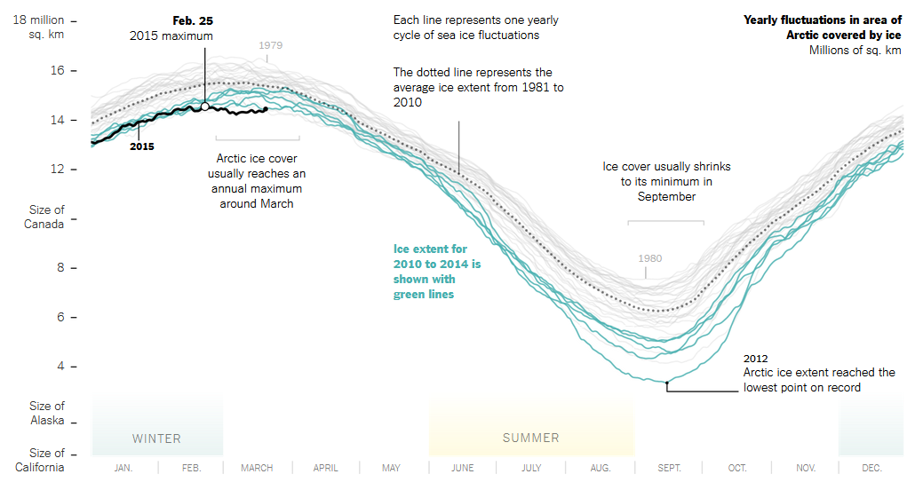
I began exploring data visualization because I often disliked my own figures but wasn’t sure why. Then, I encountered visuals, like the one from the New York Times below, that show Arctic sea ice extent—simple yet elegant and powerful. I used to wonder why my figures never looked like that. So, I set out to learn more about the principles of effective figures and how to create them in a scientific context.
Before diving into details, it’s helpful to reflect on what defines a “good” figure. In my view, a good figure should be:
- Correct and transparent: It should represent the data truthfully and maintain integrity.
- Useful: It should convey and support your main point.
- Easy to read and understand: It should be accessible to the entire intended audience.
- Beautiful: It should be visually interesting and pleasing (keeping in mind that we are scientists, not designers).
- Appropriate: Different contexts have different requirements.
In this post, I’ll guide you through 7 steps to meet these requirements.
Data visualization is a vast topic and I can only scratch the surface here. If you want to dig deeper, I highly recommend looking at the following free books:
- Fundamentals of Data Visualization (Wilke): No coding, but filled with examples and practical tips for creating accurate, beautiful and effective scientific figures.
- Data Visualization: A Practical Introduction (Healy): An excellent introduction with practical examples using R and ggplot2
- ggplot2: Elegant Graphics for Data Analysis (Wickham et al.): Focused on learning plots with ggplot2
👣 1: Consider the context
Before designing a figure, consider the context in which it will be used. Ask yourself who your audience is and how familiar they are with the topic. The complexity of your figure will depend on whether you present it to lab colleagues or a general audience.
Also, consider common practices in your field. If there are established plot types or colors for indicating certain elements, it’s best to adhere to them. This helps your audience quickly understand the content.
Another important factor is where you will present your figure, as different contexts require different designs.
In a paper, readers typically have the time and expertise to digest complex visuals. While figures are usually viewed on a screen, some may print papers in black and white, so your figure should function without color.
Posters offer more design freedom, which can help attract people (e.g. by unconventional figures or flashy colors). Although people can spend some time at a poster, simplicity is still important here, as readers might quickly move on to the next poster as soon as they feel overwhelmed by complexity.
During a talk, figures should be much simpler than in a paper. Your audience often only has a minute to understand the figure before you move to the next slide. Therefore, copying complex figures from a figure into a slideshow usually does not work very well. So simplify your figure for your talks. For more complex figures, make sure to take advantage of animations to build your figure as you speak.
👣 2: Make your data transparent
When you make a figure, you always have the choice what to show (and not show) and how to show it. There are many principles here, and I want to talk about two of them.
Principle 1: Summary statistics hide data
Maybe, you know the famous “Datasaurus” figure below. It shows 13 completely different data sets with identical summary statistics. Therefore, visualizing the raw data points is crucial for understanding what’s going on and how the 13 data sets differ.

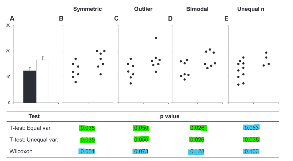
On a more serious note, the different data - same statistics phenomenon is important to consider when interpreting bar graphs with error bars (commonly showing mean and standard error of the mean or standard deviation). In their short paper from 2015, Weissgerber et al. advocate for abandoning bar plots for this reason. In their figure below, they demonstrate that data with different characteristics (symmetric, outliers, bimodal distribution, unequal sample size) yield different statistical p-values, yet all data sets have the same summary bar plot.
Alternatives to bar plots
So, what can you use instead of bar plots? Let’s explore some alternatives using an example data set.

A first step to displaying more of your data is to use a boxplot instead. Boxplots provide more information about the distribution of the data:

In our example data set, the boxplot below already provides a clearer view of the data distribution. We can see, for example, that group B has several outliers, group C has high variance and group D has very low variance in the interquartile range (i.e., the box is large and small, respectively).

We can improve further by adding the raw data as jittered points to the boxplot. Jittering means adding a small, random value to the x-value of the points to prevent overlapping. This is useful when you have categories on the x-axis, where slight shifts to the left or right do not affect interpretation. This plot makes the raw data transparent and provides a better understanding of the data distribution without being overly complex. We can see that group A has a symmetric distribution, group B has many outliers, group C is bimodal, and group D has only a four data points.

One step further are raincloud plots. They show everything from raw data points, to summary statistics and the data distribution.

Principle 2: The Principle of proportional ink
Another important principle of transparent data presentation is the principle of proportional ink (see this post by Bergstrom and West for more examples and explanations). This principle states that the sizes of shaded areas in plots should be proportional to the data values they represent.
The most important example for this is bar plots. Bar plots code values in two ways: the length of the bar and its position on the y-axis. To adhere to the proportional ink principle, bars must always start at zero. If they don’t, the bar lengths no longer represent relative data proportions. This misleads readers who intuitively compare bar lengths and thus overestimate the differences between the groups.

Not every plot needs to start at zero though; there are valid reasons to begin the y-axis elsewhere. Below, you see two plots displaying the same data: life expectancy across different continents. Both plots are effective but highlight different aspects of the data. In the bar plot (panel a), relative comparisons are easy because all bars start at 0. In the point plot (panel b), the y-axis begins at the minimum value, simplifying absolute comparisons by setting the baseline at the African continent. Since we use points and their positions on the y-axis rather than shaded areas to represent values, the reader is not misled if the y-axis does not start at 0.

👣 3: Choose the right chart type
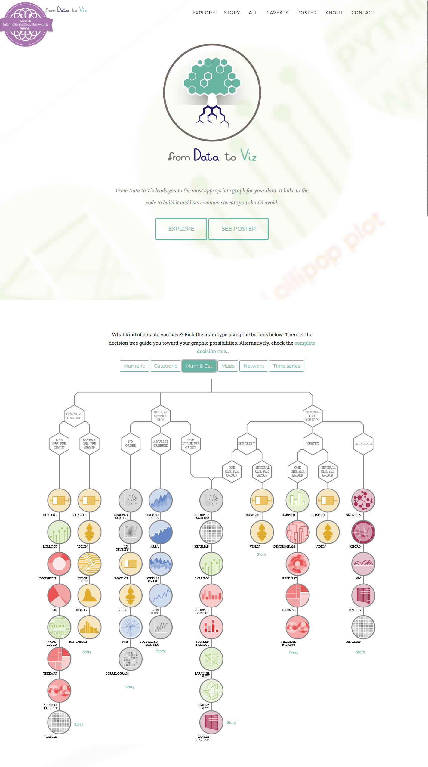
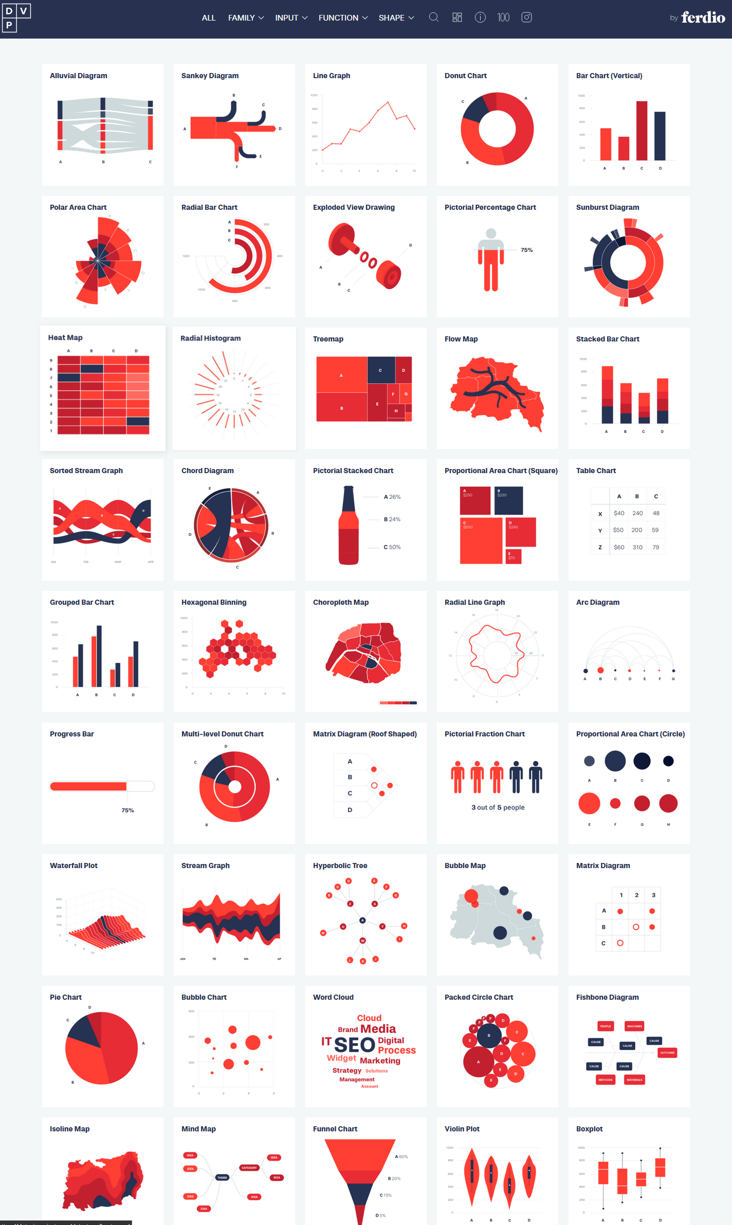
There are countless chart types for various data and messages. However, exploring all of them is not the purpose of this post. Instead, I want to provide you with two excellent online resources to explore different chart types that allow you to specifically find options that fit your data structure and the message you want to convey:
Something fundamental to keep in mind for all different chart types is that different channels for coding the data are perceived with different accuracy by humans.
Below, you see different channels with which we can represent the same data. How accurate we can judge the data decreases from left to right.
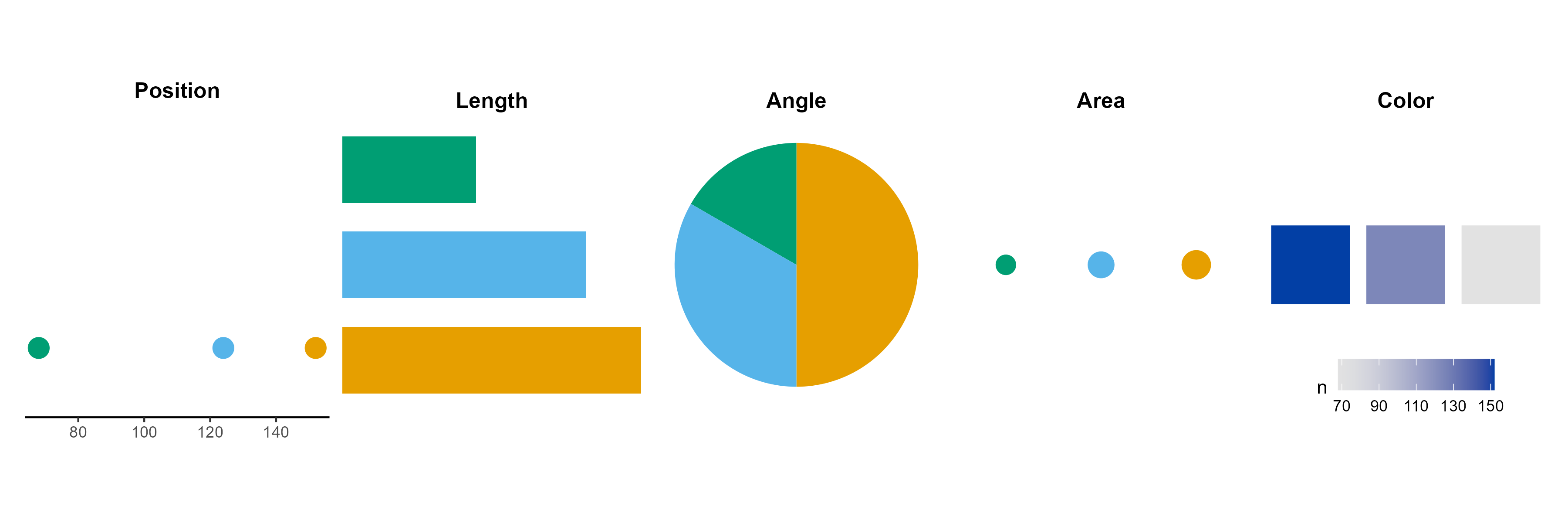
You can see this quite clearly: In the point plot, the differences between the three groups are evident, and I can read the exact numbers from the axis. I would argue that this holds true for the bars and the pie chart as well. However, it becomes more challenging to obtain precise numbers from these charts, especially as the number of groups increases. In the area and color plots, comparing the groups is extremely difficult. Can you see, for example, that the green area is half the size of the blue area?
That doesn’t mean color is bad—it’s effective for showing trends or patterns when exact values aren’t critical (like in heatmaps). However, be mindful of which visual channel suits your purpose. If you need accurate judgment, use chart types that rely on the left channels. For a more general assessment, you can utilize the right channels.
And you can always combine channels — like using both length and position, or adding labels to increase the accuracy of judgement.

👣 4. Focus on the core message
The reader’s attention is limited, so be concise and focus on your main message. Identify which variables you need and which variables you can omit. Then make design choices that help to convey and highlight the main message.
Arrange your plot so it’s easy to extract the main message
The same data can be arranged in different ways that focus the reader’s attention on different main messages.
For example, if you plot life expectancy in Asia and Europe over time using side-by-side bars (top plot), you emphasize the year-by-year comparison, highlighting that Europe is consistently higher than Asia, but the gap is closing. If you plot the two continents separately (bottom plot), you emphasize the temporal trend within each continent. This difference is subtle, but if you include more continents, the distinction in messages between the left and right plots becomes much more pronounced.

Choose an appropriate plot type
In addition to arranging the data, you can choose plot types that emphasize your main message. Different plots tell different stories, even when showing the same data.
If our main message from the life expectancy data is to highlight the closing gap between Asia and Europe, we can use a dumbbell plot (top plot below). This type is effective for showing differences between two groups over time, clearly focussing the reader’s attention to the distance between the groups. If our main message is to show trends over time, we can use a time series line plot (bottom plot below). This type is ideal for showing the trends, and readers will immediately recognize it as representing a time series.

Keep it simple
Don’t overcomplicate your figures and bury your main message. I may be tempting to include all variables in a figure since you’ve already measured them and can only put a limited number of figures in a paper. However, remeber that the reader’s attention is limited; we should focus on the main message and avoid unnecessary distractions.
In the (admittedly exaggeraged) example below, I plotted all possible variables from the life expectancy data set in one figure. It shows everything, but readers will likely be lost and need to spend a lot of time extracting any message from it.

Let’s say our main message focuses on life expectancy and GDP differences worldwide. Why then plot population sizes and trendlines? Why use a scatter plot? To show differences in life expectancy and GDP between continents, I could use two ridgeline plots instead and indicate the world average with a vertical line. This approach makes it easier and quicker to understand the results related to the main message.
So only plot what you really need to convey your message. For additional variables, you can always use the appendix.

👣 5. Consider the journey
I know this soundsstrange but reading a figure is a timeley experience. What I mean by that is that we don’t look at a figure and understand everything at once. We look at the elements step by step before we come back to understand the figure as a whole.
So when creating or improving a figure, put yourself in the reader’s shoes and consider their journey through it. What will they look at first, second, etc.? How many steps does it take to understand all the elements? The goal should be to make the journey for their eyes (but also their brains) to understand the entire figure as short as possible.
So let’s say we want to tell a story about the GDP of China and India compared to the rest of Asia. We might have start with a plot like the following:

So, let’s consider the journey. First, the reader reads the title and sees that it’s about China and India. So they will look for the bars for China and India. This is challenging, as the bar labels are not in alphabetical order, and the reader must rotate your neck to read them. Once they find China and India, they want to compare them to other countries. However, if they look away, they risk losing the bars for China and India and have to search them again.
So the question is: How can we make the journey easier and more pleasant?
Flip the axes
First, we can flip the plot axes to avoid the neck rotation. This makes it easier to read the labels and compare the bars. Flipping the axes is often possible in bar plots and is usually a good idea to improve readability of long text labels.

Highlight the main message
In the next step, we can highlight our main message about China and India. In general, we can achieve this by highlighting the important parts of the plot, while simultaneously de-emphasizing the less important parts.
Consider the following text:
Effective visualization helps us understand data quickly. Patterns emerge naturally, while colors enhance meaning. Good design choices and proper emphasis make insights accessible to everyone.
The blue words pop out immediately because they are highlighted against the light grey words. These highlights draw the reader’s pre-attentive focus to specific elements, which they notice without conscious thought. You can use color, size, shapes, or arrows to create such highlights.
In our example, we can highlight the bars for China and India while de-emphasizing the other countries. This makes it clear that those two bars are essential to the message without even reading the title.

We can make the understanding even faster,by using different colors for China and India and introducing them already in the title. This way, we place the information where the reader’s eyes are already are. When they first read the title they will know what the colors represent without the need for a legend or axis labels to distinguish between China and India.

Order your data purposefully
Another way to make the journey shorter for the reader is to order your data purposefully instead of using the default ordering which is usually alphabetical.
Consider the following two plots that display the same data but with different country orders. Both figures are effective for different purposes. The left plot is ordered by GDP, making it great for comparing values across countries, but it is not ideal for quickly locating a specific country. In contrast, the right plot allows for quick country lookups, but comparing GDP between countries is quite cumbersome.

Below, you find another example of how ordering data shortens the journey. In the figure, the legend is not arranged alphabetically, which would be the default. Instead, I ordered the legend to match the lines. This allows the reader to follow the lines and the legend easily from top to bottom. This simple trick makes the reader’s journey much more convenient.

👣 6. Less is more
The importance of differences
Humans perceive differences (e.g. in colors, shapes, sizes, etc.) very well and attribute meaning to them. You already saw this when we talked about highlights that pop out:
Effective visualization helps us understand data quickly. Patterns emerge naturally, while colors enhance meaning. Good design choices and proper emphasis make insights accessible to everyone.
But if there are too many differences, we don’t see anything specific anymore:
Effective visualization helps us understand data quickly. Patterns emerge naturally, while colors enhance meaning. Good design choices and proper emphasis make insights accessible to everyone.
The same is also true for figures. Therefore, differences should always be used to communicate and not to decorate.
For example, in the left plot below, I differentiated countries by color. This is not necessary and the colors are just a distraction. But intuitively, readers try to interpret the differences in color where there are none. In the right plot, I only use one color for all countries. This makes the figure much cleaner and it’s easier to focus on the important message.

Declutter your figure
A helpful concept for decluttering figures is the data-to-ink ratio — the idea that as much of the “ink” in a figure as possible should represent actual data rather than decorative or redundant elements. While this is partly a matter of taste, consider which parts of your figure are essential and which may be duplicated or unnecessary. However, be cautious not to remove elements that assist the viewer in reading and understanding the figure.
Below you see the same plot, showing unemployment over time in the US, in a more (left) and less (right) cluttered version.

To declutter the figure on the left, I removed the x-axis title since it is clear that it represents a time series. I also replaced the “in thousands” label on the y-axis with a “k” after the numbers and removed the grey background. These changes made the plot cleaner and more elegant. Other decisions are debatable and depend on the figure’s purpose, such as whether to keep all grid lines. While they help the viewer read exact values, removing some can make the plot cleaner and emphasize the overall trend.
Ultimately, what you keep or remove should align with your message and how you want the reader to interpret the figure. Decluttering often enhances your figure—just make sure you don’t oversimplify.
👣 7: Make it accessible
Element size
Make sure that all elements are adequately sized, including text, line width, and point size. The appropriate size depends on the context. For instance, when creating a figure for a presentation, use larger text and element sizes, and test them on a projector beforehand. Often, the default sizes when creating figures on computer screens are too small for other settings.

Contrast
Ensure the contrast between elements is strong enough for clear readability. If you’re unsure, use tools to check your contrast levels, such as this one or this one.

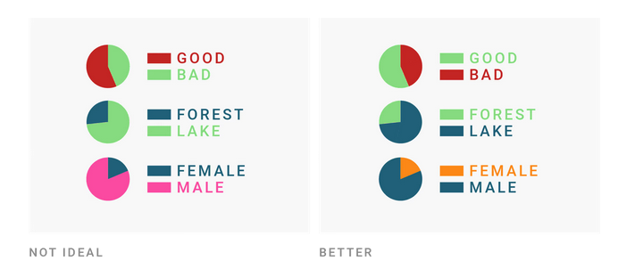
Intuitive Colors
Use colors that are logical and intuitive, keeping in mind our associations with them. This can be cultural, as different societies link the same colors to various concepts and emotions. However, some colors are more universally understood and should not be changed to avoid confusion (e.g., red is hot, blue is cold, green is forest, and blue is lake).
Colorblind-friendly colors
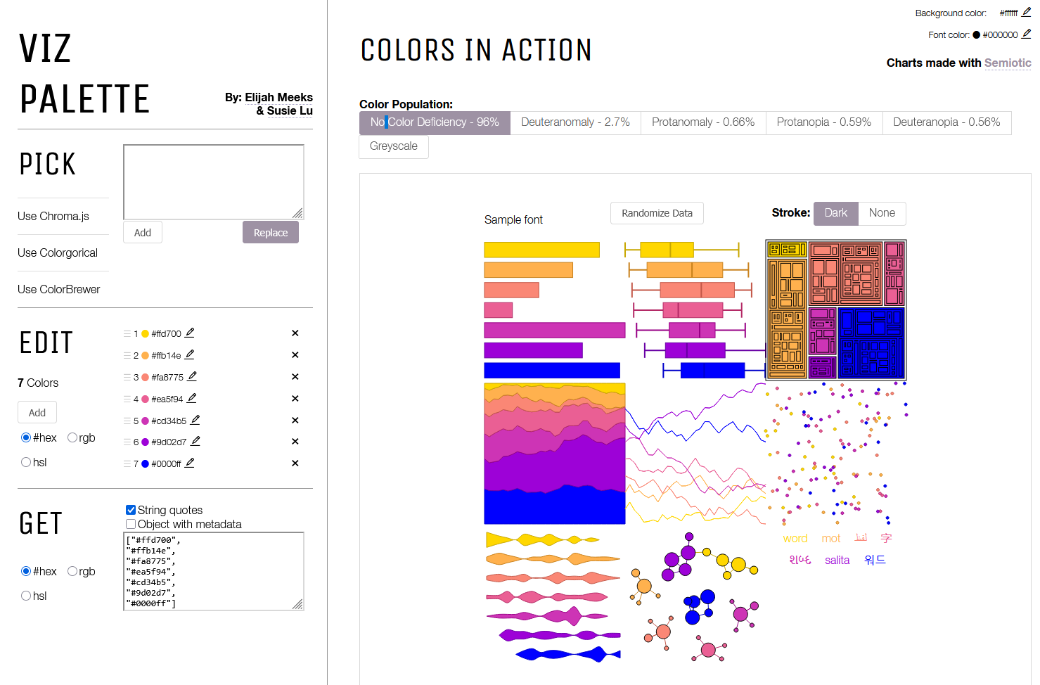
Choose color palettes that are colorblind-friendly. There are many options available, such as the Viridis color palettes and colorBrewer palettes). If you are unsure about your color choice, you can use tools to test your palette against various types of color blindness:
If you are an R user, you can have a look at this article and the colorspace package which provides many tools for selecting and manipulating colors.
Redundancy
Redundancy increases the likelihood that everyone can see the differences. Instead of relying solely on color to differentiate between groups, you can also use shapes (at least for data with few groups). This benefits people with color blindness and those who print your paper in black and white.

Conclusion
We now have looked at 7 steps to make our figures better:
- Consider the context
- Make your data transparent
- Choose the right chart type
- Focus on the core message
- Consider the journey
- Less is more
- Make it accessible
Of course, each step could be a separate blog post, and I’ve only scratched the surface here. And it’s also not necessary to think about all this for every figure. But even a small tweak can sometimes make a big difference. For me, it was already immensely helpful to learn these core concepts. I started using them to improve my own figures and analyze the figures I see in papers or posters.
Let me know in the comments if you have other tips and tricks for improving figures!